The last part of my conversation between Dennis G.
Dennis wrote -
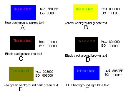
Thanks for the info. I have worked with hex before so I understood all the stuff you gave me. I added all the HEX RGB color codes to the text test BMP I sent you.

I have included it with this E-mail. One problem with computers is they add colors in a positive since with the RGB method. For people to see colors on the computer the red, green, and blue ray guns are adjusted to produce colors that are in between. For colorblinds this really screws things up because we need a different combination of the red, green, and blue color guns. In other words, computer screens make colorblind people at a greater disadvantage then we really are if we are viewing reflected sun light of an object where all the colors are available for our brains to mix colors with. This is why during World War II colorblind soldiers were uses extensively for mapping and spy operations. Camaflouge (SP?) that has color mixes to fool the normal color vision person would stand out to a colorblind person because the color mixing ratios were off from true plant life and the artificial stuff for the colorblind. The computer screen poses the same dilemma for a colorblind person.
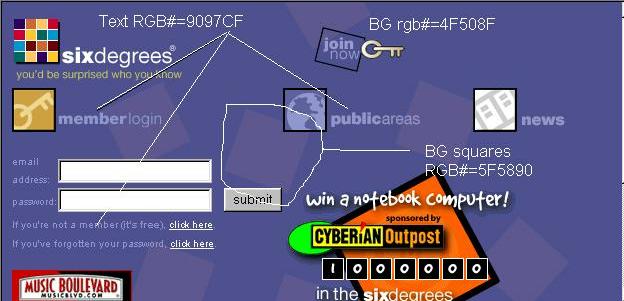
By the way I also copied the www.sixdegrees.com WEB page and add the RGB# to the various parts of the WEB page. I have included the BMP also. Is this the page you have trouble reading the text? Do you see the squares on the background?

It appears that only the red and green values change the most between the areas I pointed out, except for the increased blue in the text. I have no trouble reading this page, but I would have chosen brighter colors.
Later
Martin wrote -
My work machine is 256 color 800x600. My home machine has a high resolution screen. On my home machine I could see the squares you were referring to fairly distinctly but I cannot see them on my work machine. On the machine at home I could also see some of the colors more easily. I tried another experiment and printed out the squares in black and white. In all the squares but E the text was readily visible. The text in E was also visible but only faintly so.
The squares you alluded to on black and while print of the sixdegrees.com BMP are only faintly visible.
These lead me to believe that color intensity may play as much of a role in color detection as the presence of the color itself. That is color saturation is as important as the mix.
Obviously there are factors at many levels that affect what can be seen, when, under what conditions and by whom. It would be interesting to see if some generalized rules could be formulated that would help web developers construct sites that were readable by all people. For instance there are several sites which have these dark-bordered backgrounds (usually on the left side of the screen) and they insist on bleeding their text from the dark-border area to the light area which has the effect of making that part of the text difficult if not impossible to read.
Interesting -
I can see the large text you pointed to fairly well. I have a lot of trouble reading the small text but I can read it, and what squares? I don't see any squares at all
I also have trouble with the yellow(?) text in the upper left corner which says "you'd be surprised who you know" That text is very thin - small and fine-lined
I think that in both cases there is not enough intensity for the color to register.
BTW I am adding these conversations to my site as we go along. This will be the tenth in the series. I may also add some new links later on this week.
Dennis wrote -
Well that now makes a lot of sense as to why you were having problems with the blue gray background. I just couldn't figure out why your vision seemed to be very typical of a protean (red deficient) colorblind yet you were having trouble with blue and gray. Those background squares on the sixdegrees.com page were pretty obvious to me.
Well good everything seems to make sense now. By the way, I wasn't able to get the background squares on the sixdegrees.com WEB page to disappear until I went to 4 bit (16 colors). They were still very visible (no change to me) at 8 bit (256 colors). You might want to check your work computer setup to make sure you are at 256 color. If you are, then your monitor is probably not allowing the colors. The WWW is a pretty difficult place to work in with only 16 colors because so many WEB pages are designed for 256 or greater color.
Another thought came to me. Why not design a WEB page that can be easily read with 16 colors then everyone including color blind people should have no trouble reading it. Or like I wrote previously stick to blues and greens and everyone will see them. The color changes on the sixdegrees.com web page are not that pronounced (the RGB values change by ~50 or so out of 255) and we have no trouble seeing those colors with 256+ color screen.
Last updated March 5, 2001