Color blindness is a result of a defect in the cone receptors in the retinas of the eyes. Color blindness is a male dominant trait, but is carried by the female. One male in twenty suffers from some form of color blindness, but only one in several hundred females are color blind.
Color blindness is the general term used by most people but maybe in this politically correct world we should refer to it as chromatically challenged. However in reality the symptoms range from an inability to see one color, or shades of one color, to a lack of ability to see any color at all. Because it is a result of a cone defect, colorblind people are also prone to night blindness, and may have extreme difficulty in seeing in low light, or their color perception may be greatly reduced in low light.
What color blind people actually see is hard to explain or describe to one who isn't colorblind, and probably equally hard to determine by someone else. To get an idea of the degree of difficulty, try closing your eyes and describing the color green to someone who cannot see or who is totally color blind.
Describe it without using descriptors such as it is the color of grass, etc. With the exception of blue (which has become synonymous with cold) and red (which has become synonymous with hot) it is very difficult if not impossible to describe a color except in terms of things which are that color, or in terms of another color.
Regardless of the level of color blindness involved, almost all those afflicted can see dark objects on a light background. They may see them as shades of gray but they can distinguish. As the level of intensity approaches equilibrium the ability to distinguish diminishes.
By equilibrium I mean that the intensity of the colors involved approach each other (the dark objects become lighter and the background becomes darker).
The most common color perception problems are with certain color combinations such as yellow on green, green on red, red on green, blue on red, red on blue, and red on black. This last is particularly annoying and dangerous, because it means that unless we are concentrating, those flashing little LED displays become almost invisible. I have almost no perception of LED displays unless I am up close, and the diode is very bright.
By contrast since color blind people don't see color the same way others do, we tend to come up with combinations that are offensive to others but may be neutral or even pleasing or to us.
Some color blind people tend to gravitate to bright, vivid colors because they can be detected more easily. Muted colors or low intensity colors (text, lines or bands where there isn't enough color to register) cause difficulty or are indistinguishable.
To get an idea of the problem, are these the same color?
red
and
red
How about these?
red
and
red
Both "reds" in the top illustration are colored red. In the bottom illustration the first "red" is actually maroon
For some reason the media likes to print charts in gradients of the same color, or gradients of color from the same end of the spectrum. This is especially evident in the weather segments where they use color bands to delimit the different temperature bands, or the "color radar" displays where they use greens, yellows, reds, oranges and whites but in such small resolution that the different parts of the storm intensity blend together. Can you tell the difference between the colors blue and navy? Or how about green and olive? Or how about yellow and orange?
They also seem to like light on dark, this isn't necessarily bad, but if there isn't enough color to create a contrast, or enough intensity, those of who are colorblind might as well be looking at a black band. When these light on dark or light on light, combinations are used it is very annoying. Many film producers like to use red title lettering which is very difficult to perceive.
If you intend on using red and green, make sure that when one changes to the other, that there is a suitable blinking, noise text or something to augment it. Please stay away from pastels, washed out colors, low intensity colors, and color combinations from the same part of the spectrum.
With the exception of the red and red illustration above, the color words used on this page are colored with standard font color codes for that color (i.e. red is colored "red", blue is colored 'blue" etc.). If you have difficulty seeing any of those colors you may also be partially colorblind.
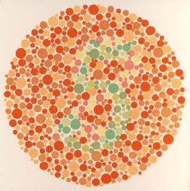
Below is one of several charts used to test for colorblindness. There is a number in the center of the circle. If you can see the number, chances are you are not colorblind. However, the number apparently is more visible with some resolutions and display settings than with others, so if you cannot see the number that does not necessarily mean you are colorblind.
The ability to see color is at least partially dependent on the amount of color reaching the cones. Here is the same chart only slightly bigger. Can you see the number now?
For those who did not see the number - it is "5". The number is fairly large and centered in the circle. Now do you see it?
I have had many conversations with people who have visited these pages and who have hopefully come away with a better understanding of colorblindness and what it means to be colorblind. Some have given me permission to place the texts of our conversations on these pages in the hope that they will help others.